Elastic Stack - Setting up a dashboard in Kibana for data analysis
Published On: 2019/05/11
In this article of Elasic Stack series, I would like to introduce you to the Kibana dashboard which you love to use for data visualization.
In the article Elastic Stack - CSV data processing we have loaded the csv records of taxi trip. Now this data let us create visualization pallets and view it in Kibana dashboard.
Use Case
In this use case we will try to get the insight of how may trips were there during rush hours and overnight. To achieve this, I have made modification in the pipeline and reloaded the data. In the pipeline add convert processors to change the number fileds to integer/double and added a script processor to derive a new field trip_period. As per the data dictionary the field “Extra” has the values of overnight and rush hour charges.
        {
          "convert":{
            "field": "passenger_count",
            "type": "integer"
          }
        },
        {
          "convert":{
            "field": "trip_distance",
            "type": "double"
          }
        },
        {
          "convert":{
            "field": "fare_amount",
            "type": "double"
          }
        },
        {
          "convert":{
            "field": "extra",
            "type": "double"
          }
        },
        {
          "convert":{
            "field": "mta_tax",
            "type": "double"
          }
        },
        {
          "convert":{
            "field": "tip_amount",
            "type": "double"
          }
        },
        {
          "convert":{
            "field": "tolls_amount",
            "type": "double"
          }
        },
        {
          "convert":{
            "field": "improvement_surcharge",
            "type": "double"
          }
        },
        {
          "convert":{
            "field": "total_amount",
            "type": "double"
          }
        },
        {
          "script": {
            "lang": "painless",
            "source": """
                if(ctx.extra == 0.0){ctx.trip_period = 'normal';}
                if(ctx.extra == 0.5){ctx.trip_period = 'rush';}
                if(ctx.extra == 1.0){ctx.trip_period = 'overnight';}
            """
          }
        },
        {
          "date":{
            "field": "lpep.pickup_datetime",
            "target_field" : "lpep.pickup_datetime",
            "formats" : ["yyyy-MM-dd hh:mm:ss"]
          }
        },
        {
          "date":{
            "field": "lpep.dropoff_datetime",
            "target_field" : "lpep.dropoff_datetime",
            "formats" : ["yyyy-MM-dd hh:mm:ss"]
          }
}Creating Data Table in Kibana
- Go to the visualization page.
- Select the index which has the taxi trip data.
- Select the Data table
Configure Metrics
In the Aggregation filed select “Count” and give the custom label “Number of Trips”.
Buckets Configuration
In this data table , it would be good to present the data in a table with the fields Month, Trip Type, Trip Period , Number of Trips. As per the data dictionary we have two types of trips
1= Street-hail 2= Dispatch
In the bucket configuration Split the Rows and add the fileds Month, Trip Type & Trip Period as sub buckets.
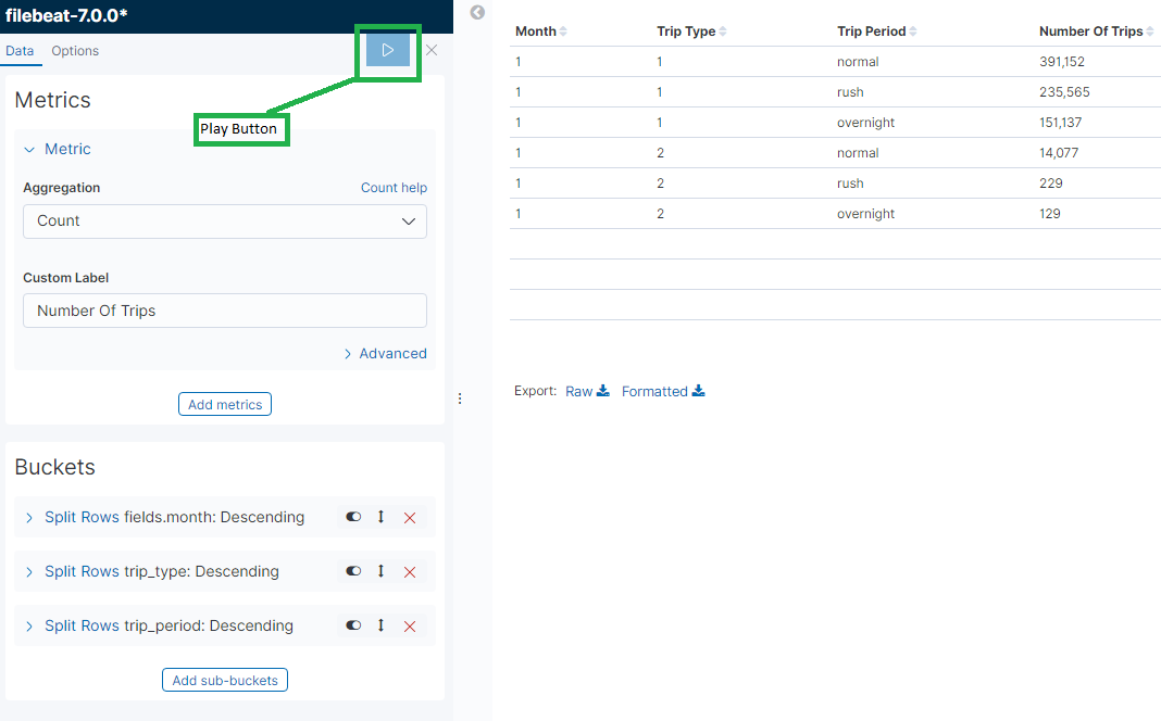
Click on the play button to view the data in the table. Save this visualization as “Trip Period”
Dashboard Setup
Go to the Dashboard page and create a new Dashboard. Kibana UI verion 7 gives you clear instruction to add a visualization. Click on the Add button and select the “Trip Period” visualization panel. Save this dashboard with a preferred name.
Conclusion
In this article, I tried to explain, with Trip Period usecase, how to create visualization component and include it in the dashboard. This article covers the initial setup for our data analysis journey
Your feedback is a Reward!