Elastic Stack - Kibana Pie Chart
Published On: 2019/05/14
In the article Elastic Stack - Setting up a dashboard in Kibana for data analysis we have created a simple data table to view the number of trips during normal hours, rush hours and overnight.
In this article, we will create a Pie Chart to depict it which gives a much better understanding of the data.
Use Case
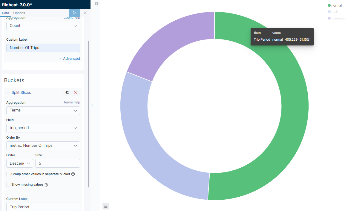
The Taxi operators would like to know the percentage of trips during normal hours, rush hours and overnight so that they can deploy appropriate number of taxis. In this case we can use the trip_period fields which we have dreived and the count of trips to depict it in a pie chart.
Creating Pie Chart in Kibana
- Go to the visualization page.
- Select the index which has the taxi trip data.
- Select the Pie Chart
Configure Metrics
In the Aggregation filed select “Count” and give the custom label “Number of Trips”.
Buckets Configuration
In the Buckets configuration choose Split Slices and then use Terms aggregation on trip_period field.
Dashboard Setup
We will be using the same Dashboard which we have created in the article Elastic Stack - Setting up a dashboard in Kibana for data analysis. Click on the Add button and select the “Trip Period Chart” visualization panel and then save the dashboard.
Conclusion
As we have seen, we are now able to configure Pie chart with fields in the document.
Your feedback is a Reward!