Create a simple angular filter panel lib in nx workspace
Published On: 2020/06/11
Monorepo is the new trending term in the frontend development. Many of the large companies have already implemented this in their development environment in one form or the other. This term is now familarized in the frontend world by the enty of a toolkit called Nx. Many enterprise and startups are now following this trend in the web development. Let us setup a small working project to learn an overview of the Nx workspace.
 In this article we will go throgh the creation of a shared filter panel component in Nx workspace and use it in an Angular project in the same workspace.
Create Nx workspace
Go to the folder where you want to create the monorepo and execute the below command to create the nx workspace with an angular project cloud-messenger.
$ npx create-nx-workspace@latestCreate a UI lib
As our sample project is to create a shared filter panel module and use it in multiple components or projects, let us create a UI library and the components filter-panel and filter-dialog.
ng g @nrwl/angular:lib ui

nx g component filter-dialog --project=ui --export
nx g component filter-panel --project=ui --export
As this is a nx angular project you could see angular.json file and nx.json file in the root of the workspace. Each library and project which we create in this workspace will have an entry in these two files.
Models in filter panel UI component
The filter panel has 3 model classes FilterCriteria, FilterAttributeOperator, FilterConfig.
- The FilterCriteria class holds a single filter condition.
export interface FilterCriteria {
    attribute: string;
    operator: string;
    value: string;
    hash: number;
}
When a new filter criteria is added to the panel the hash of the new filter will be checked against those that are existing in the filter panel to avoid duplicate filter condition.
The FilterAttributeOperator hold the attribute which has to be displayed in the attribute/field selection box and its corresponding operators which needs to be populated in the operator selection box.
export interface FilterAttributeOperator {
    attribute: string;
    operators: string[]
}
The FilterConfig is a collection of FilterAttributeOperator.
export interface FilterConfig{
    filterAttributes: FilterAttributeOperator[];
}
Filter Dialog
The filter dialog is an angular material dialog component
  constructor( private fb: FormBuilder,
    private dialogRef: MatDialogRef<FilterDialogComponent>,
    @Inject(MAT_DIALOG_DATA) data) {
      this.description = data.description;
      this.filterConfig = data.filterConfig;
    }

  ngOnInit(): void {
    this.form = this.fb.group({
      attribute: [null, [Validators.required]],
      operator: [null,[Validators.required]],
      value: [null, [Validators.required]]
    });

  }
When there is a change in the selected value in the attribute selection box, a function will be invoked to reload the operators corresponding to the selected attribute value.
<mat-form-field>
    <mat-select placeholder="Select Attribute" formControlName="attribute" (selectionChange)="reloadOperators()">
        <mat-option [value]="item.attribute" *ngFor="let item of filterConfig.filterAttributes ">{{item.attribute}}</mat-option>
    </mat-select>
</mat-form-field> reloadOperators(){
this.filterConfig.filterAttributes.forEach(it => {
if(it.attribute === this.form.controls['attribute'].value){
this.operators = it.operators;
}
});
} save() {
const hashVal = this.hashCode(JSON.stringify(this.form.value));
const filterCriteria = {...this.form.value, hash:hashVal};
this.dialogRef.close(filterCriteria);
}Filter Panel
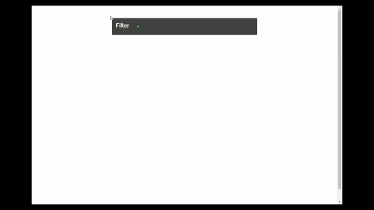
The filter panel is made using material card and chips. Each filter criteria is a chip added into the card content.
<mat-card-content>
    <mat-chip-list>
        <mat-chip *ngFor="let it of criteriaList" [removable]="removable" (removed)="remove(it)">
            {{it.attribute}} {{it.operator}} {{it.value}}
            <mat-icon matChipRemove *ngIf="removable">cancel</mat-icon>
        </mat-chip>
    </mat-chip-list>
</mat-card-content>const dialogConfig = new MatDialogConfig();
dialogConfig.disableClose = true;
dialogConfig.autoFocus = true;
dialogConfig.data = {
id: 1,
title: 'Filter Criteria',
filterConfig: this.filterConfig
};
const dialogRef = this.dialog.open(FilterDialogComponent, dialogConfig);The dialogRef variable created above holds a reference to the initaited filter dialog and is used to transfer the data from the dialog component to the panel component.
dialogRef.afterClosed().subscribe(
    data => {
        if(data){
        if(!this.isCriteriaExists(data.hash)){
            this.criteriaList.push(data);
        }else {
            this.snackBar.open('Filter criteria already exists', 'Undo', {
            duration: 2000,
            });
        }
        }
    }
);
If the criteria is already exists then the isCriteriaExists function prevents it to be added to the panel but shows a message using snackbar material component.
isCriteriaExists(hash:number): boolean{
  let isExist = false;
  this.criteriaList.forEach(it => {
    if(it.hash === hash){
      isExist = true;
    }
  });
  return isExist;
}
Export the shared UI library
Configure the exports attribute of the @NgModule to export the FilterPanelComponent component so that it can be used in the other componet as nxworks-filter-panel.
@NgModule({
  imports: [
    CommonModule,
    MatDialogModule,
    MatInputModule,
    ...
    FormsModule,
    ReactiveFormsModule],
  declarations: [FilterPanelComponent, FilterDialogComponent],
  exports: [FilterPanelComponent],
})
export class UiModule {}
The index.ts in the UI library exports the UI module and its model classes
export * from './lib/ui.module';
export * from './lib/model/filter-config'
Using the filter panel in the project component
Add a component in the cloud-messenger project which uses the filter panel component.
ng g @nrwl/angular:component pages/message-providers-page --project cloud-messengerFilter configuration
This component has the filter configuration for the filter panel and a list of FilterCriteira
  public filterCriteriaList: FilterCriteria[];

  public filterConfig:FilterConfig = {
    filterAttributes:[
      { attribute: "Test1", operators: ["eq", "ne"]},
      { attribute: "Test2", operators: ["eq", "gte"]},
      { attribute: "Test3", operators: ["eq", "lte"]},
    ]
}<nxworks-filter-panel
[criteriaList]="filterCriteriaList"
[filterConfig] = "filterConfig"
></nxworks-filter-panel>Conclusion
In this article we have gone through the creation of a filter panel shared component in angular. The complete source code of this project is available in nxworks Github repository.